Exam 1 - Take-home
ST511 - key
Packages
You will need the following packages for the exam.
Now is a good time to save and render
Package Questions
- When you render your exam, you will notice additional text underneath the
library(tidyverse)andlibrary(tidymodels)code.
-- Attaching core tidyverse packages ...

-- Conflicts ...
Hide the text (not the code itself) using the appropriate code chunk argument. You do not need to include any text to answer this question.
Answer: You can hide all the text by using the code chunk options message: false and warning: false
- Describe, in detail, the difference between the
library()function, and theinstall.packages()function.
Answer: install.packages downloads an R package from CRAN onto your local machine. library opens up the package, letting us use the functions / data sets within.
- Suppose you forget to library your packages, and instead just try to run the following code.
penguins |>
  summarize(mean_peng = mean(bill_length_mm))
What will the code produce?
Answer: The code will produce an error. Without running your packages, R will not recognize the penguins data (palmerpenguins package) nor the summarize function (tidyverse package)
Now is a good time to save and render
Question 1
We are going to use the very familiar penguin data for question 1.
- In a single pipeline, calculate the median bill length for each species of penguin. Your answer should be a 3x2 tibble.
# A tibble: 3 × 2
  species   med_bill
  <fct>        <dbl>
1 Adelie        38.8
2 Chinstrap     49.6
3 Gentoo 47.3- In a single pipeline, calculate the min, max, and IQR of bill length for each species of penguin. Your answer should be a 3x4 table. Hint: Check the help file for the function
summarize()for Useful functions.
penguins |>
  group_by(species) |>
  summarise(max = max(bill_length_mm, na.rm = T),
            min = min(bill_length_mm, na.rm = T),
            IQR = IQR(bill_length_mm, na.rm = T))
# A tibble: 3 × 4
species max min IQR
<fct> <dbl> <dbl> <dbl>
1 Adelie 46 32.1 4
2 Chinstrap 58 40.9 4.73
3 Gentoo 59.6 40.9 4.25- In a single pipeline, recreate the following plot below.
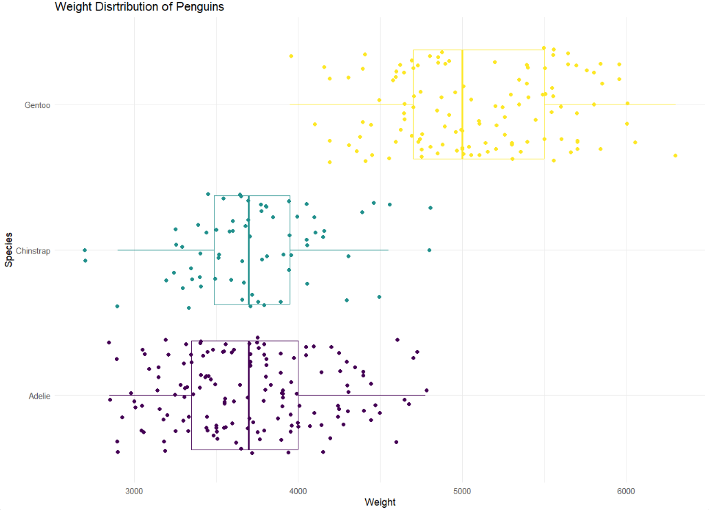
Hint: This plot uses theme_minimal and scale_color_viridis_d(option = “D”)
Note: Your dots will not look exactly the same as the graph below. They will be similar.
penguins |>
  ggplot(
    aes(x = body_mass_g,
        y = species,
        color = species)
  ) +
  geom_boxplot() +
  geom_jitter() +
  scale_color_viridis_d(option = "D") +
  theme_minimal() +
  theme(legend.position = "none") +
  labs(title = "Weight Distribution of Pengins",
       x = "Weight",
       y = "Species")
Warning: Removed 2 rows containing non-finite outside the scale range
(`stat_boxplot()`).Warning: Removed 2 rows containing missing values or values outside the scale range
(`geom_point()`).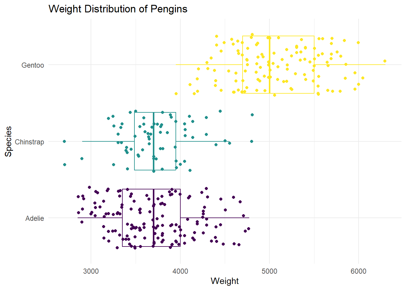
Now is a good time to save and render
Question 2
Data
Read in the airplanes_data.csv for the follow questions. For the following question(s), we will be using the following variables:
flight_distance - distance in miles
customer_type - categorized as either disloyal Customer or Loyal Customer
A disloyal customer is a customer who stops flying from the airline. A loyal customer is someone who continues flying with the airline.
airplanes <- read_csv("https://st511-01.github.io/data/airplanes_data.csv")Rows: 492 Columns: 4
── Column specification ────────────────────────────────────────────────────────
Delimiter: ","
chr (3): satisfaction, customer_type, type_of_travel
dbl (1): flight_distance
ℹ Use `spec()` to retrieve the full column specification for this data.
ℹ Specify the column types or set `show_col_types = FALSE` to quiet this message.# A tibble: 2 × 2
customer_type count
<chr> <int>
1 disloyal_customer 86
2 loyal_customer 406In as much detail as possible, DESCRIBE the simulation scheme for…
Be as precise and add context when possible, and use information from the actual data (e.g. sample sizes, etc.) in your answer. Use the order of subtraction loyal - disloyal
- conducting a hypothesis test for evaluating whether the average flight distance are different between types of customers.
Answer: To simulate our sampling distribution for a hypothesis test, we first must need to make the assumption that our null hypothesis is true, or that the true mean flight distance between disloyal and loyal customers are equal. Under this assumption we can mix together our 86 disloyal customer flights and 406 loyal customer flights, and permute (randomly shuffle) back out into two new groups of size 406 and 86. Next, we will take the mean of each new group, and subtract the mean in the same order that our null/alternative hypotheses were set up as (loyal - disloyal). This process is repeated many many times to create our simulated sampling distribution.
- creating a confidence interval for estimating the difference between the average flight distance for the different types of customers.
Answer: So simulate our sampling distribution to estimate our population parameter, we need to keep the integrity of our groups, and use a bootstrap sampling method. A bootstrap sampling method samples with replacement 86 times from the disloyal group, and 406 times from the loyal group. Next, the new means are calculated, and we subtract the same way our null/alternative hypotheses (loyal - disloyal).
Now is a good time to save and render
Question 3
- In this question, you are going to create a simulation based 90% confidence interval. Do you expect the sampling distribution of your difference in means to be roughly normal? Justify your answer. Add to the existing code to create any appropriate plots that would help you justify your claim. You can make more than one plot for each group if you would like. For this question, you can assume that these observations were randomly sampled from the population of all flights.
Pipeline with only loyal customer group
airplanes |>
  filter(customer_type == "loyal_customer") |>
  ggplot(
    aes(y = customer_type, x = flight_distance)
  ) +
  geom_boxplot() +
  labs( y = " ",
        x = "Flight Distance",
        title =  "Boxplot of flight distance")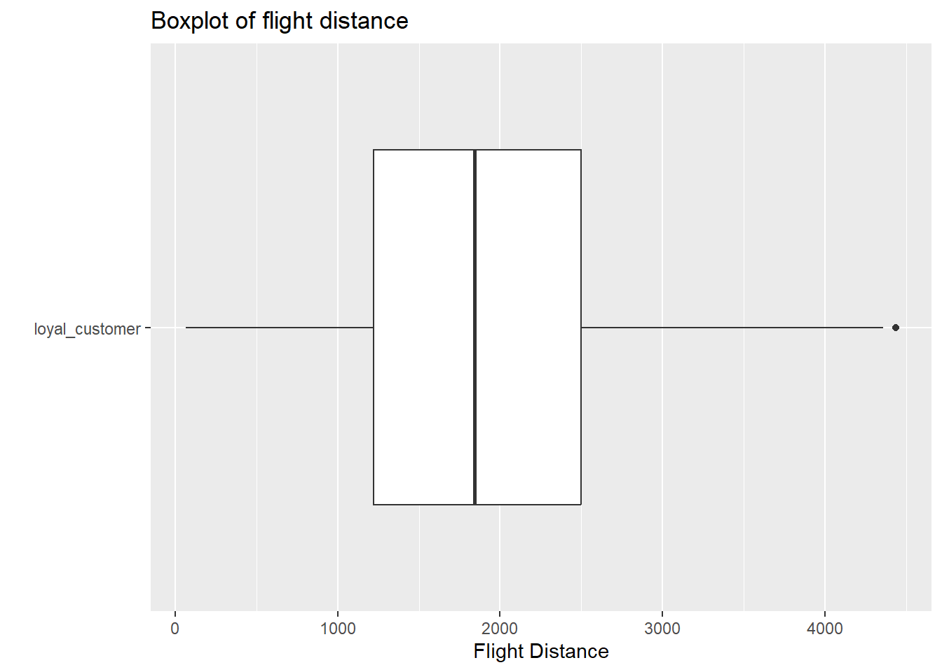
Pipeline with only disloyal customer group
airplanes |>
  filter(customer_type == "disloyal_customer") |>
  ggplot(
    aes(y = customer_type, x = flight_distance)
  ) +
  geom_boxplot() +
  labs( y = " ",
        x = "Flight Distance",
        title =  "Boxplot of flight distance")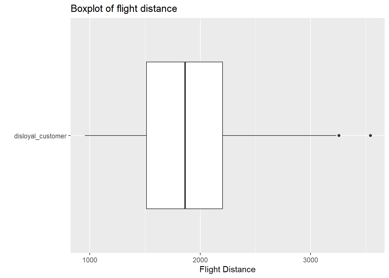
Answer In each boxplot, we see evidence of outlier(s), and slight skew to the right. However, with sample sizes larger than 60 in each group, and the skew not being extreme with many outliers, there is not enough evidence to violate the normality assumption within each customer type.
- Regardless of your answer above, Add to the existing code by replacing the
...with the appropriate information to create your simulated sampling distribution, as described in question 2. You are saving your simulated difference in means into a data set calledboot_df
Fill in the … for set.seed with your NC State ID number (ex. 001138280)
- Plot a histogram of
boot_df. Where is this distribution centered? Why does this make sense?
boot_df |>
  ggplot(
    aes(x = stat)
  ) +
  geom_histogram() +
  labs(title = "Simulated Sampling Distribution",
       subtitle = "Under the assumption of the null",
       x = "",
       y = "")
`stat_bin()` using `bins = 30`. Pick better value with `binwidth`.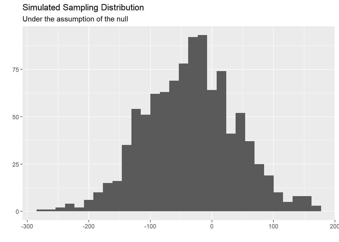
Answer This distribution is centered at/near out sample statistic. This is because we used bootstrap resample procedures to simulate this sampling distribution.
- Now, create a 90% confidence interval using your
boot_dfdata frame by filling in the...below. Then, interpret this interval in the context of the problem.
# A tibble: 1 × 2
  lower upper
  <dbl> <dbl>
1 -151.  85.7
Answer We are 90% confident that the true mean flight distance for loyal customers is 151 miles shorter to 85.7 miles longer than disloyal customers.
- Discuss one benefit and disadvantage of making an 80% confidence interval instead of a 90% confidence interval.
Answer One benefit of making an 80% confidence interval is that our interval would be more narrow, giving us more practical results to be used/understood. However, we are less confident in the interval actually contains the true parameter of interest we are trying to capture.
Now is a good time to save and render
Question 4
In this question, we are tasked to conduct a theory based hypothesis test to see if there is a relationship between a customer’s type of travel, and their overall satisfaction of the flight. That is, does the type of travel impact their satisfaction? We our investigating if more customers who are traveling for personal travel.
`summarise()` has grouped output by 'satisfaction'. You can override using the
`.groups` argument.
# A tibble: 4 × 3
# Groups: satisfaction [2]
satisfaction type_of_travel count
<chr> <chr> <int>
1 dissatisfied business_travel 129
2 dissatisfied personal_travel 85
3 satisfied business_travel 195
4 satisfied personal_travel 83For this question, we are going to use the following variables.
satisfaction - was the customer satisfied or dissatisfied with their experience
type_of_travel - was the travel for business or personal
Below, carry out the necessary steps to conduct a theory based hypothesis test (z-test). Show all your work. You may assume \(\alpha\) = 0.05.
\(H_o\): \(\pi_p - \pi_b = 0\)
\(H_a\): \(\pi_p - \pi_b > 0\)
sample statistic using the data table above
\(\hat{p_p} - \hat{p_b}\) = \(\frac{83}{83+85} - \frac{195}{195+129} = -.108\)
assumptions
We can assume independence, because the context states that these flights are a random sample from larger flights. Now, we need to check our success-failure condition.
\(\hat{p_\text{pool}} = \frac{83+195}{85+195+83+129}\) = 0.565
0.565168 > 10 (1-0.565)168 > 10 0.565324 > 10 (1-0.565)324 > 10
Because our expected counts are all larger than 10, we are can trust the results and actually carry out our analysis.
standard error calculation
\(\sqrt{\frac{0.565 * (1-0.565)}{168} + \frac{0.565 * (1-0.565)}{324}}\) = 0.047
test statistic
\(Z = \frac{-0.108 - 0}{0.047} = -2.298\)
p-value
pnorm(-2.298, lower.tail = FALSE)[1] 0.9892191With a p-value extremely large, we fail to reject the null hypothesis, and have weak evidence to conclude that the true proportion of satisfied travelers that flew for personal reasons is larger than those who flew for business reasons.
Question 5
For this question, we are going to use a ChickWeight data set. This is a data set that has data from an experiment of the effect of diet on early growth of baby chickens. Please read in the following data below.
Data
chickweight <- read_csv("https://st511-01.github.io/data/chickenweight.csv") |>
  mutate(diet = as.factor(diet),
         chick = as.factor(chick),
         time = as.factor(time))
Rows: 20 Columns: 4
── Column specification ────────────────────────────────────────────────────────
Delimiter: ","
dbl (4): time, chick, diet, weight
ℹ Use `spec()` to retrieve the full column specification for this data.
ℹ Specify the column types or set `show_col_types = FALSE` to quiet this message.- Report the mean weight and standard deviation for each measurement day. This should be a 5 x 3 tibble. Name the columns
mean_weightandspread.
# A tibble: 5 × 3
  time  mean_weight spread
  <fct>       <dbl>  <dbl>
1 0            40.8  0.957
2 2            51.2  2.63
3 4            60.8  2.75
4 6            74.8  9.22
5 8 93.8 21.6 - The chicken weights are measured in grams. Suppose that, instead of grams, you want to have the weight measured in ounces. We are going to learn a new function that allows us to create new variables. This function is called
mutate(). The help file formutate()can be found here.mutate()is in thedplyrfamily, and has similar arguments to functions we have used commonly in class, such assummarize(name = action).
One gram is 0.035274 ounces. In one pipeline, create a new variable called mean_weight_o that represents the number of ounces a chicken weights; calculate the mean weight and standard deviation of your new mean_weight_o variable for each combination of time and diet. This should be a 10 x 4 tibble.
chickweight |>
  mutate(weight_o = weight*0.035274) |>
  group_by(time, diet) |>
  summarize(mean_weight_o = mean(weight_o),
            spread = sd(weight_o))
`summarise()` has grouped output by 'time'. You can override using the
`.groups` argument.# A tibble: 10 × 4
# Groups: time [5]
time diet mean_weight_o spread
<fct> <fct> <dbl> <dbl>
1 0 1 1.45 0.0499
2 0 2 1.43 0.0249
3 2 1 1.76 0.0499
4 2 2 1.85 0.125
5 4 1 2.06 0.0249
6 4 2 2.22 0.0499
7 6 1 2.40 0.200
8 6 2 2.87 0.224
9 8 1 2.82 0.200
10 8 2 3.79 0.873 - Please recreate the following graph below.
As a reminder, a list of geoms in the tidyverse package can be found here.
Hint: Go to the reference above and look for the geom that connects observations with a line.
Hint: In the aes() function, we need to specify a group = variable.name to tell R which observations we want to connect to each other.
chickweight |>
  ggplot(
    aes(x = time, y = weight , group = chick, color = chick, shape = diet)
  ) +
  geom_point() +
  geom_line() +
  labs(title = "Chicken weight",
       subtitle = "based on diet over time",
       y = "weight (gm)",
       x = "measurement day",
       caption = "Source: Crowder, M. and Hand, D. (1990)") +
  scale_color_viridis_d()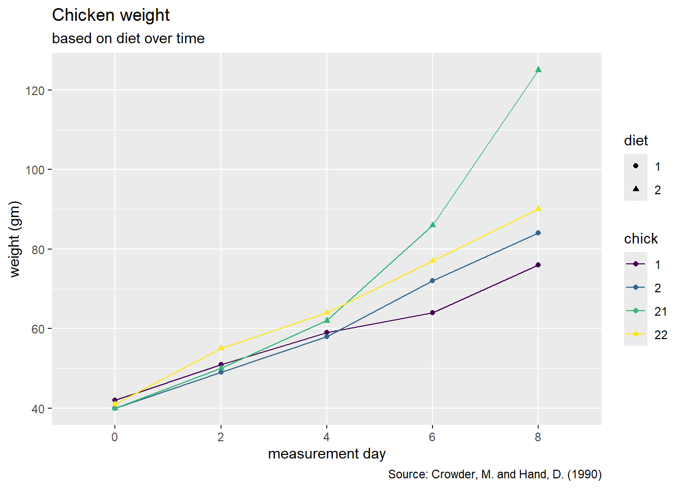
Now is a good time to save and render
